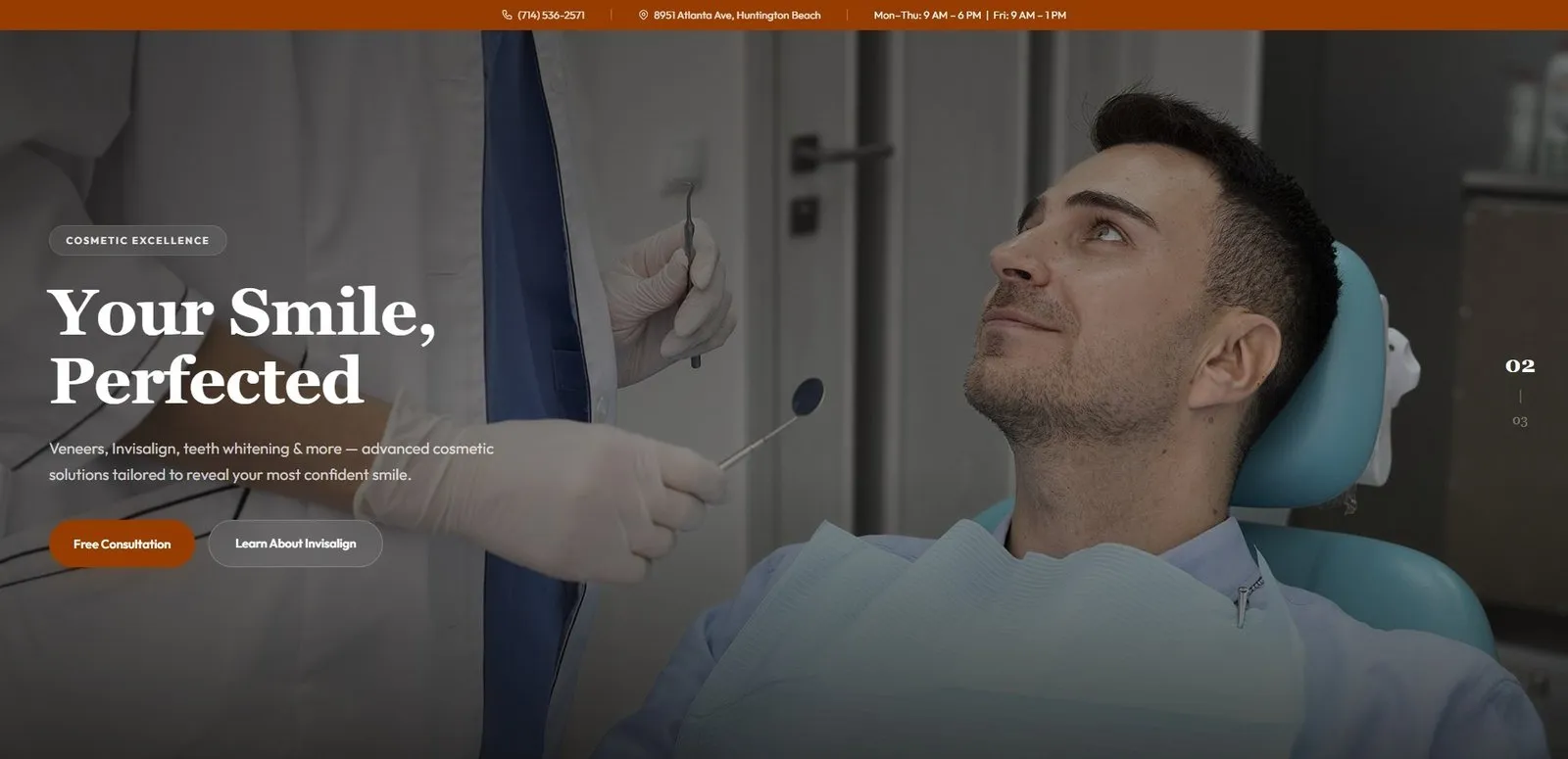
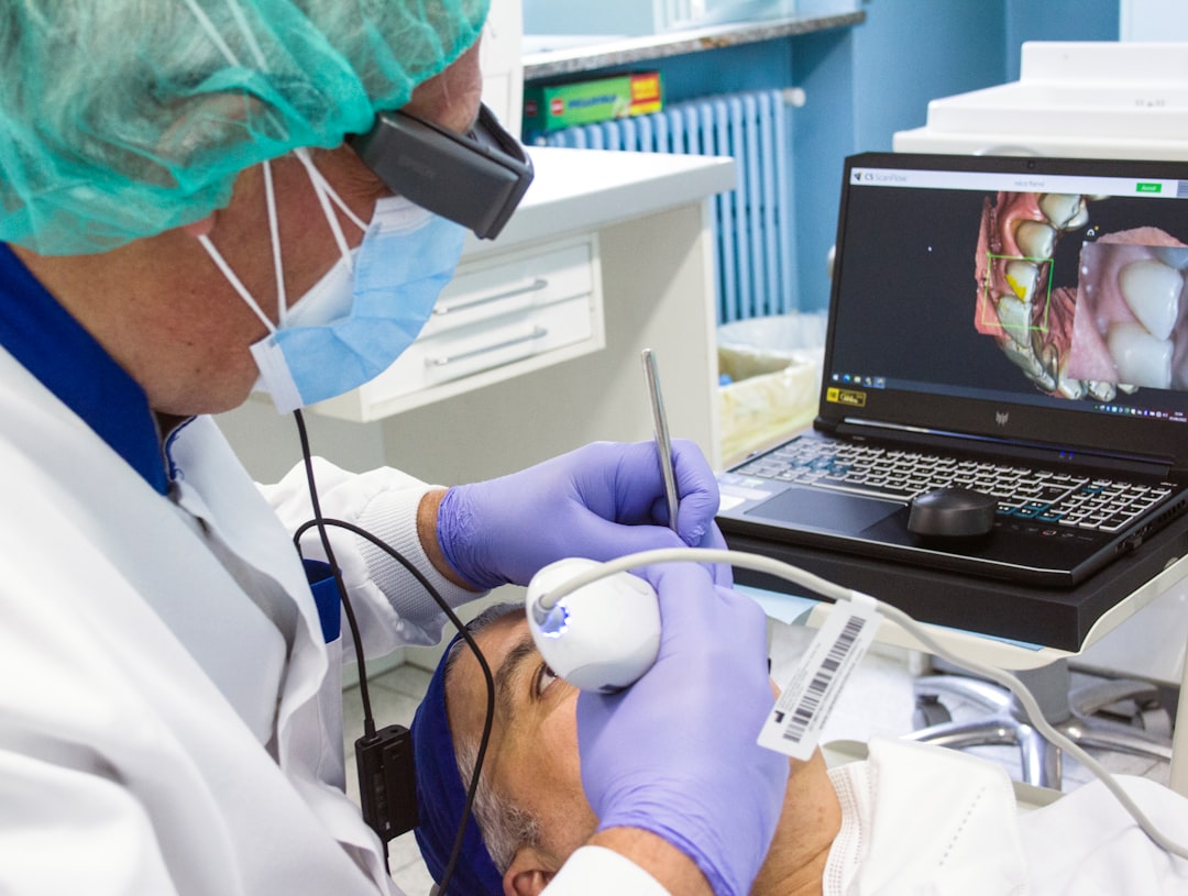
After running website audits for 50+ dental practices across Orange County, the pattern is hard to miss. The same dental website mistakes show up over and over — and they cost real patients every week. Not theoretical patients. Patients who tapped the site from a Google search, scrolled, hesitated, and then went back to the search results to pick a different practice.
This is not about pretty design. It is about the handful of fixable problems that quietly lose bookings. Below are the dental website mistakes we see most often in Huntington Beach, Costa Mesa, Newport Beach and the rest of the county — and what to do about each one.
What 50+ OC Dental Audits Reveal
Across the practices we have audited, the average dental site loses roughly 40 to 60 percent of mobile visitors before they ever reach the contact page. That is not a copywriting problem. That is a structural problem — and almost every site has the same five or six structural issues. The wider context of how websites fit into a complete acquisition system is in our dental marketing guide for Huntington Beach, which covers reviews, Google Business Profile, ads and AI search alongside the site itself.
The mistakes below are listed in order of how often they show up and how much they cost. Fix the top three and most practices see a measurable lift in calls and form fills within a month.
Dental Website Mistake #1: The Homepage Doesn’t Answer “Who, Where, What”
A visitor who lands on your homepage gives you about three seconds to answer three questions: Who are you, where are you, and what do you do? More than half of the OC dental homepages we audit fail at least one.
The fix is boring and effective. Above the fold, on mobile, show:
- The practice name and the dentist’s real photo and name
- The city — “Huntington Beach” or whichever city you serve — in the headline, not buried in the footer
- The three services that drive your revenue (cleanings, Invisalign, implants, emergency, whichever applies)
- A phone number and a “Book Online” button, both tappable
That is it. No carousel. No autoplay video of a stock smile. No “Welcome to our practice” banner. Patients are not visiting to be welcomed — they are visiting to decide whether to call.
Dental Website Mistake #2: Booking Takes More Than One Tap
The single most expensive dental website mistake we find: a “Book Now” button that opens a contact form, which opens a captcha, which opens a thank-you page, which sends an internal email, which a receptionist answers by phone, eight hours later.
Every screen between intent and confirmation drops conversions roughly 20 percent. A four-step booking flow loses two-thirds of the patients who actually wanted to book.
What works on the practices ranking and converting in Orange County:
- A sticky “Book Online” button visible on every page
- That button opens a one-screen scheduling tool (LocalMed, NexHealth, Dentrix Online Booking, or a custom form)
- The form asks for name, phone, reason for visit, preferred day — nothing more
- A confirmation screen with the booked time and the office address
If a full booking integration is months away, do the interim fix today: replace “Book Now” with a tap-to-call phone number. A phone call you can answer beats a form submission you cannot.
Dental Website Mistake #3: Mobile Load Over Three Seconds
More than 70 percent of dental searches in Orange County now happen on mobile, and the slowest sites we audit take 7 to 12 seconds to load on a real 4G connection. Visitors do not wait. They tap back, pick the next listing, and you never knew they were there.
The usual culprits are obvious once you look: uncompressed hero images at 4,000 pixels wide, autoplay video on the homepage, a WordPress theme stacked with 15 plugins, and tracking scripts that block rendering. Google’s PageSpeed Insights gives you the diagnosis in 30 seconds — the fix is usually image compression, a modern hosting setup, and removing whatever plugin is generating the most blocking JavaScript.
If a faster site is on the roadmap anyway, see how we approach this end to end in our guide on SEO-friendly web design.
Dental Website Mistake #4: Stock Photos and Generic Smiles
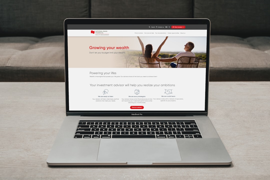
Open ten OC dental websites. Eight of them lead with the same stock photo of a model with unnaturally white teeth, photographed against a beige wall. Patients learn to ignore those photos the same way they ignore banner ads. The visual stops registering.
What works instead:
- A real, well-lit photo of the dentist — face visible, scrubs or business attire, smiling but not staged
- One or two photos of the actual office interior (the chair the patient will sit in)
- A before/after gallery with real patient consent, even if it is only three or four cases to start
Photography costs $300 to $600 from a local photographer in Huntington Beach. It is the single highest-ROI line item in a dental website refresh. The same trust signals show up in our analysis of how OC clinics win the AI-answer box for “dentist near me” searches.
Dental Website Mistake #5: Service Pages That Read Like a Brochure
A typical dental service page reads like it was rewritten from a 1998 brochure: “We offer comprehensive Invisalign treatment in a comfortable, modern environment.” That sentence does nothing. It tells the patient nothing they did not already assume.
A service page that converts answers the questions patients actually have, in the order they ask them:
- What is this and what does the appointment look like?
- How long does it take and how much does it cost in this office?
- What does recovery or aftercare involve?
- Who is the dentist and what is their experience with this procedure?
- What do real patients say?
- How do I book?
Plain language, specific to your practice. If a 14-year-old could read it without getting bored, the page is working. Add an FAQ block at the bottom — that same FAQ doubles as the content AI search engines pull from when patients ask Gemini or ChatGPT.
Dental Website Mistake #6: A Contact Page That Hides the Phone Number
A surprising number of OC dental sites bury the phone number behind a form, or display it only on the contact page, or worse — display it as an image so it cannot be tapped. Every one of those decisions costs calls.
The bar to clear:
- Phone number in the header of every page, tappable on mobile
- Phone number, email, and address in the footer
- A real Google Map embed on the contact page with the actual practice pin
- Hours listed plainly — not “by appointment” if you have walk-in availability
- Driving and parking instructions if your office is in a complex (most of OC is)
Fix These First — A 30-Minute Action List
If you have one Saturday morning, do these in order:
- Add a tap-to-call phone number to the header of every page.
- Compress every image on the homepage to under 200 KB.
- Replace any stock smile photo with a real photo of the dentist.
- Cut your “Book Now” path to one tap and one screen.
- Add the city name to the homepage headline.
- Write a one-paragraph service description for each procedure that uses patient language, not clinical language.
You will not have a perfect site by Sunday — you will have a site that loses fewer patients on Monday. The deeper rebuild can come later, and when it does, our local SEO service for Orange County dentists handles the audit, redesign and ongoing optimization with a written scope and documented deliverables.
Talk to a Real Person About Your Site
Every dental practice we have worked with started with a free, plain-English audit of these exact mistakes — no jargon, no upsell. If you want a real second opinion on your site before you spend another dollar on ads or SEO, contact Orrku Media and we will send back a written audit within 48 hours. Founder-led, transparent pricing, and a 5.0 rating from 50+ clients across Orange County.
Photos by Quang Tri NGUYEN, Alex Kotliarskyi, PiggyBank and Harold Hisona on Unsplash.